

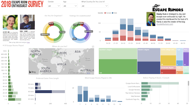
 |
| Click the image to see the actual interactive dashboard. Best viewed on a large screen. |
The dashboard is best viewed on a large screen as it does not resize for mobile.
Some Tips
The filters on the top of the pages ("Gender", "Age", "What Country Do You Live In") will resize the visuals to only show data from your selection.
- For example, if you select "United States" (from the drop down menu), all charts now only display data from enthusiasts with the response of "United States" for the question "What country do you live in?". It looks like the below, although it's hard to see differences in a small image so please try it out for yourself.
 |
| "United States" filter selected so all charts represent US enthusiasts |
Clicking on a segment in a visual will show you how much that segment represents in all visuals as part of the entire data set (overall visuals will not resize). To clear your selection, click again anywhere on any chart.
- If you click on the United States on a visual, in this case the map, the data will look like the below
 |
| The charts still show the entire survey data but with the United States responses highlighted |
You can quickly compare how various attributes and percent contributions change based on slicing the data by say age, number of escape rooms played or any other criteria found on the dashboard.
Let me know what you think and how it can be improved!
No comments:
Post a Comment