Featured Post

Best Escape Rooms In Athens (Greece)

Odeon of Herodes Atticus (Not an escape room but a beautiful Roman theater you should see) Athens had the highest amount of world class game...

Showing posts with label Interactive. Show all posts

December 10, 2019

Escape Room Enthusiast Survey Visualization

What a fun community!

The 2019 Escape Room Enthusiast Survey Visualization was created in an entirely different style when compared to last year's version. Last year's visualization presented Errol and Lee-Fay's results in a single interactive page. This year I tried to bring some excitement by focusing on the community aspect of the survey, rather than just the data. It was quite an effort to reach out to people via Facebook, Slack and other channels and I hope the escape room community enjoys the results! Note that it's best viewed on a large screen.

Remember the visualization is interactive, so you have to click on filters and charts to get the most out of it.

Select each question to unlock Easter eggs

For example, the filters will dynamically change the page content (results and images) when you choose a different survey question. You can even filter to see how the responses were like in your own country.

Not only will Survey results update, so will the image to the right

The page below allows you to see "who we are" with some demographic and geographic data about survey respondents.


I'm always trying to learn and improve so please let me know what you think of the visualization that you can find by clicking here.

Randy

October 11, 2018

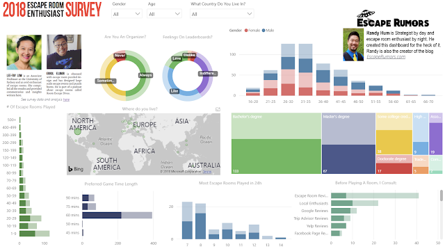
2018 Escape Room Enthusiast Survey Dashboard

Click the image to see the actual interactive dashboard. Best viewed on a large screen. 
I wanted to play around with Lee-Fay and Errol's 2018 Escape Room Survey data so I created this interactive dashboard. Unlike a normal infographic, you can filter data or click segments of the various graphs see the charts dynamically update. It's pretty cool if you play around with it.

The dashboard is best viewed on a large screen as it does not resize for mobile.

Some Tips

The filters on the top of the pages ("Gender", "Age", "What Country Do You Live In") will resize the visuals to only show data from your selection.
  • For example, if you select "United States" (from the drop down menu), all charts now only display data from enthusiasts with the response of "United States" for the question "What country do you live in?". It looks like the below, although it's hard to see differences in a small image so please try it out for yourself.

"United States" filter selected so all charts represent US enthusiasts

Clicking on a segment in a visual will show you how much that segment represents in all visuals as part of the entire data set (overall visuals will not resize). To clear your selection, click again anywhere on any chart.
  • If you click on the United States on a visual, in this case the map, the data will look like the below 
The charts still show the entire survey data but with the United States responses highlighted

You can quickly compare how various attributes and percent contributions change based on slicing the data by say age, number of escape rooms played or any other criteria found on the dashboard.

Let me know what you think and how it can be improved!